For a long while the option panels where something that people could only find in premium (commercial) themes, and for a good reason. The pricing of their licenses allowed the premium theme developers to invest more time in giving theme users the ways to do through these panels what they could not do through coding.
With the buzz created around these themes, regular users became aware of what could really be achieved, and thus, those that could not afford the license of a premium theme, became more selective with the free ones. A good-looking theme was not enough anymore, and WordPress developers realized it.
A good premium theme would bring its developer not only a good amount of money, but also recognition in the community, and this is where the free theme developers scored their biggest points. Now that their “turf” was endangered they had to react, and they did. For premium themes like Thesis or WP Unlimited, users have now alternatives like Thematic, Hybrid, Carrington, WP Framework or my own (even if not a framework) Simple Balance.
Why should free theme developers consider adding an options page?
Because being “cool” is just not enough anymore. Theme developers need to learn how to be useful. Free stuff can be either useless and ignored or useful and praised. I’m yet to see the developer offering a free theme without gaining something from it, be it awareness, expertise, backlinks, donation money, you name it! But none of these are achieved through an uncompetitive – even if free – product.
5 Most looked for options in a WordPress theme
“Stand out from the crowd!” If I had a penny for every time I read this I’d laugh at Shoemoney’s AdSense check image sipping a chilled cocktail somewhere on a tropical island, but you know what? This saying is so true that it cannot be repeated enough, and users KNOW IT! Theme users want to be able to have their own identity online. They need to be able to customize their themes and make them express who they are and what they believe in. And this is where options pages come into play. What are the most looked for options? Let’s see…
1. Logo and / or header image update / replacement
It doesn’t matter if it’s a professionally designed logo or a simple Windows Paint play. If it gives the blogger satisfaction and he wants to display it, let him do so. Add either a file upload box or an input box where the user could enter the full URL to the logo image to use. Same goes for the header images.
2. Layout structure
If you’re developing a 2 column theme, give the user the option to choose to display the sidebar either on the left, or on the right. With 3 column themes, you can give them even more options, like having the content centered, between the sidebars, or having both sidebars on the same side (right or left) of the content. If only takes a couple of PHP conditions and some “visionary” CSS coding.
3. Custom navigation menus
Don’t expect users to want every page that they publish to show up in their blog’s main navigation area. Give them the option to select which pages should show up there, and why not, add their own links, even if external.

4. Custom RSS URLs and email subscription forms
Implementing a FeedBurner email subscription form is fairly easy for any developer, and I’m pretty sure that any dveloper knows how to customize such a script. The fact that it functions mostly based on a simple user ID should make the customization even easier through a theme options page.
5. Advertising management
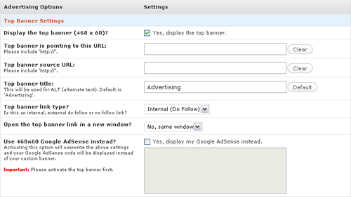
Not everyone uses services like BuySellAds, or is affiliated with an advertising network. Some users actually prefer to take care of the advertising themselves. So, why not give them the possibility to do so by adding a few more field to the options page. Let them select the number of banners they need displayed, do-follow option, position of banners and so on. It takes a bit to develop, but the user response to it is amazing.

Additional options you could consider implementing
While the 5 options above are the most looked for, some users might also find the following options useful:
- Overall switch between serif and sans-serif typography;
- Theme color adjustments. Here are a couple of web-based color picker scripts you could use: one, two, three and four;
- Alternatively, you can offer a built in color schemes system;
- Custom “featured” areas;
- Additional, customizable widget areas;
- Twitter updates area;
- And the list could go on and on…
The limits are set by your knowledge and enthusiasm
While the enthusiasm is not something you train, but rather have it or not, knowledge can be trained. Remember that the WordPress Codex is your best friend, and the support forums can be of tremendous help. Additionally, Stefan Vervoort of DivitoDesign and WPToy has put together a very useful PDF called the “WordPress Theme Development Checklist”. Do take a look (and use it!).
So, the next time you think of releasing a free theme, ask yourself this: Is you theme competitive enough? If it’s not, it will not stand a chance when the alternatives are so smart!
