![]() It’s a fact. Readers want RSS updates. They are easier to manage, to search and follow. And when readers wanted them, bloggers provide.
It’s a fact. Readers want RSS updates. They are easier to manage, to search and follow. And when readers wanted them, bloggers provide.
Have you ever wanted to subscribe to a blog’s feed, but no matter how much you searched, you could not find the link? It’s frustrating!
The RSS subscription box is one of the most important elements of your blog’s design. It offers a good deal of branding solutions and it can turn out to be decisive in your readers’ choice of following (or not) your updates.
Let’s observe together these 10 RSS subscription box designs and draw conclusions at the end upon the DO’s and DON’T’s.
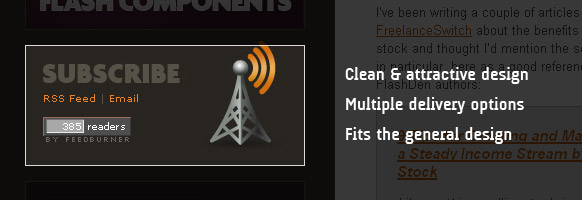
FlashDen Blog
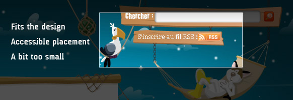
David Torondel
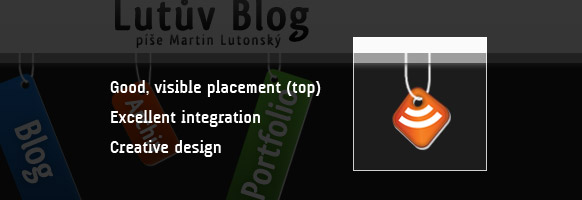
Lutův Blog
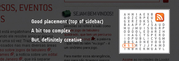
Loodo
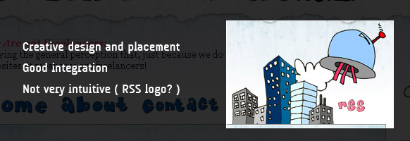
We Are Not Freelancers
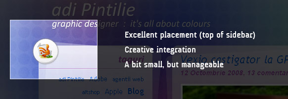
Adi Pintilie
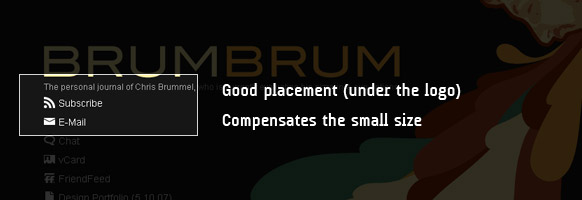
BrumBrum – Chris Brummel
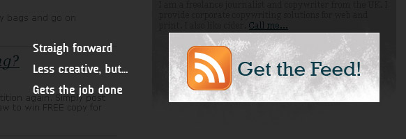
Whitley Journalism
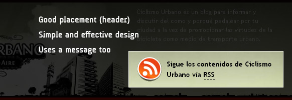
Ciclismo Urbano
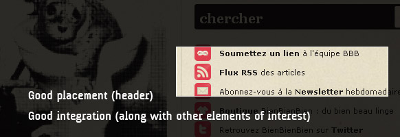
BienBienBien
RSS Subscription Design Tips
Nice designs right? So, based on them, what conclusions can be drawn?
RSS placement
- The link must be visible;
- Best choices are the top banner (header) and top of sidebar (s).
RSS link size
- Definitely not huge;
- Medium works best;
- Good placement can compensate for a smaller size.
RSS design
- Casual users are used to the RSS logo;
- Integrate the design with the overall blog layout;
- Play with the icon, but keep some elements of the original design.
Extra options
- Add a message, encourage visitors to subscribe;
- Add an email delivery option.
I’m sure that if you follow these (not so many) rules, your RSS subscription box will definitely boost your subscriber count, not to mention the good effects on your blog’s design.
Note: This post marked the launch of a new post category on Blogsessive – Blog Design – covering design tips and inspiration.
