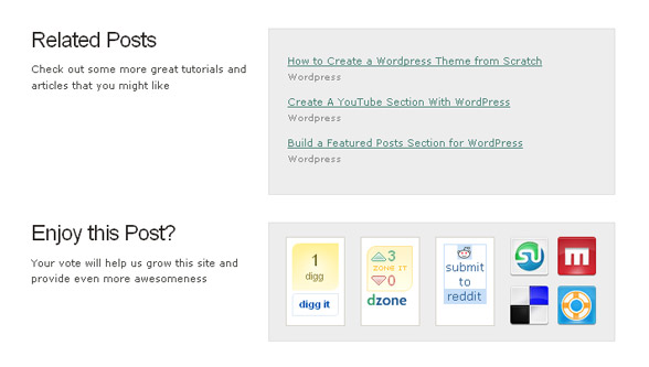
It’s a proven fact that a blog post’s footer is a “pause zone”. That’s why, people encourage you to place ads there, because you have more chances of catching the eye of your readers.
But, if it is a good place to place ads, why not take it one step further. Sure, some bloggers placed links to social media websites or to related blog posts in that are, but not giving it its deserved design attention minimizes its impact on readers.
Why not treat that area as a separate element of your blog’s structure? Why not take advantage of any of its effects:
- Encourage further reading;
- Promote featured content;
- Traffic growth;
- Bounce rate reduction;
- Social media exposure;
- Encourage subscription and many more.
As a reader of Blogsessive you must have noticed each post’s footer, and from my experience as Blogsessive’s webmaster, I can confirm that the results are amazing.
After tweaking the design and encouraging users to subscribe, my subscribers’ count almost doubled in a matter of weeks.
It’s a shame that mostly design blogs have adopted this technique, while other bloggers think that a “ShareThis” widget and a “Related posts” plugin does the job. It does part of the job, when you could get more!
They did, and now pride themselves with a big readership and followship:
GoMediaZine.com

Devlounge.net

Tutorial9.net

NetTuts.net

The next time you reconsider your blog’s design, keep an eye on this area too. Make sure you use its full power.
